
20 million users. Four metrics that matter. One mobile app that got measurably better at every one of them.
+22% user engagement
+14% 30-day retention
+18% offer redemption conversion
20M users on the redesigned app
Development
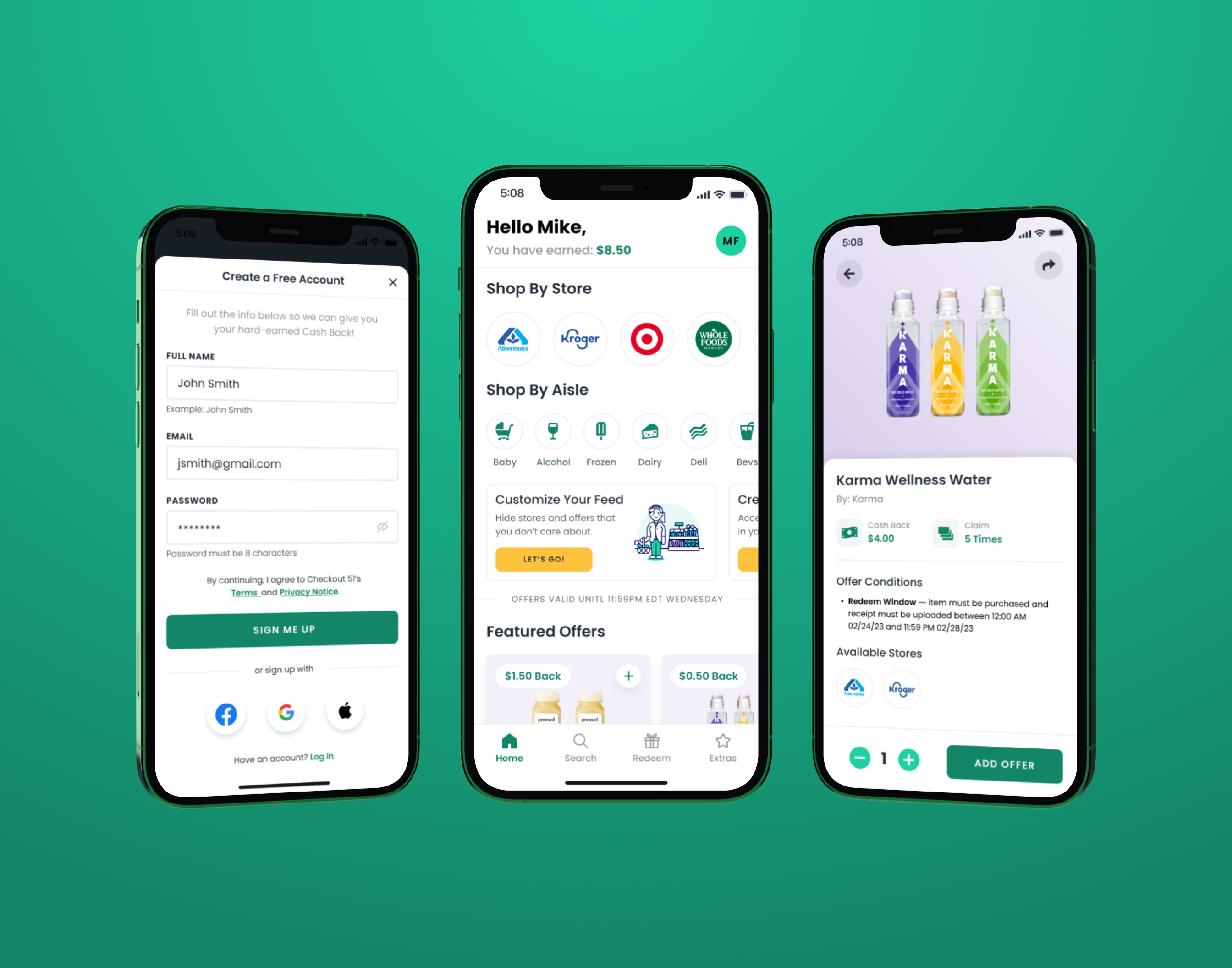
Checkout 51 is a cashback rewards app. Users browse offers, buy products, upload a receipt, get money back. Simple loop. 20 million users running it.
When I joined Neptune Retail Solutions in August 2021 as Product Design Manager, the app had been accumulating product debt for years. Cluttered home screen. Browsing friction. A visual identity that didn't match where consumer mobile design had gone. Legacy patterns that made simple actions feel complicated.
The product worked. It just didn't feel like it did. And in a category where users can switch to a competitor in thirty seconds, "feels worse than the competition" is the thing that kills you quietly.
I led the end-to-end redesign of the app across iOS and Android, partnered with product and marketing executives on the company-wide rebrand that wrapped around it, and built the first cross-platform design system in the company's history. Three things, one release window, 20 million people on the other end.
Here's what moved, and what moved it.
Role Product Design Manager (Lead Designer on the Checkout 51 redesign)
Duration Aug 2021 to Mar 2022
Company Neptune Retail Solutions
Product Checkout 51 (iOS + Android consumer cashback app)
Team Myself plus two Junior Designers & User Researchers
The old home screen was a grid fight. Featured offers, bonus offers, trending offers, new offers, and the user's saved list, all stacked in a way that asked users to scan six things before deciding to do one. We reframed the home screen around a single question: what's the one thing this user is most likely to act on right now? Everything else moved one layer deeper.
The reframe sounds simple because it is. It was also the single most contested design decision in the project. The product org was nervous about demoting the other modules. The data after launch made the case: engagement was up 22% with fewer surface-level options, not more.
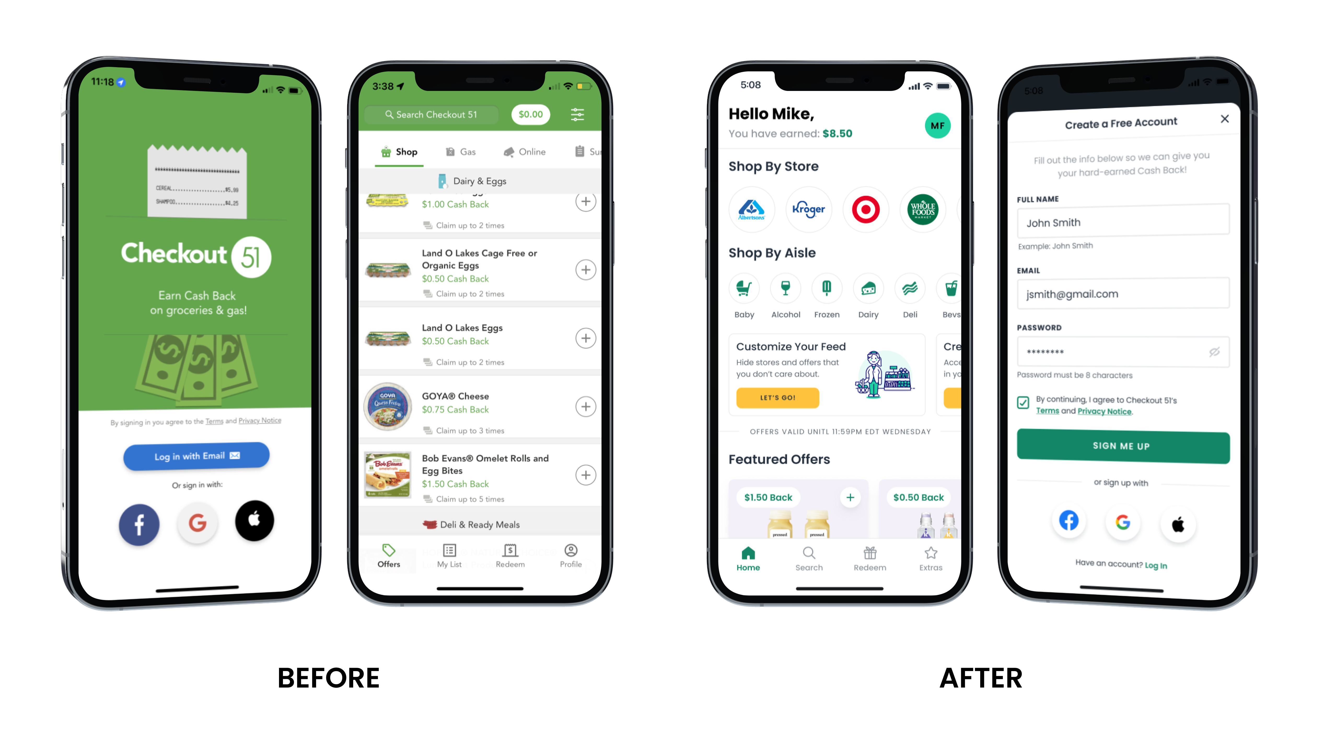
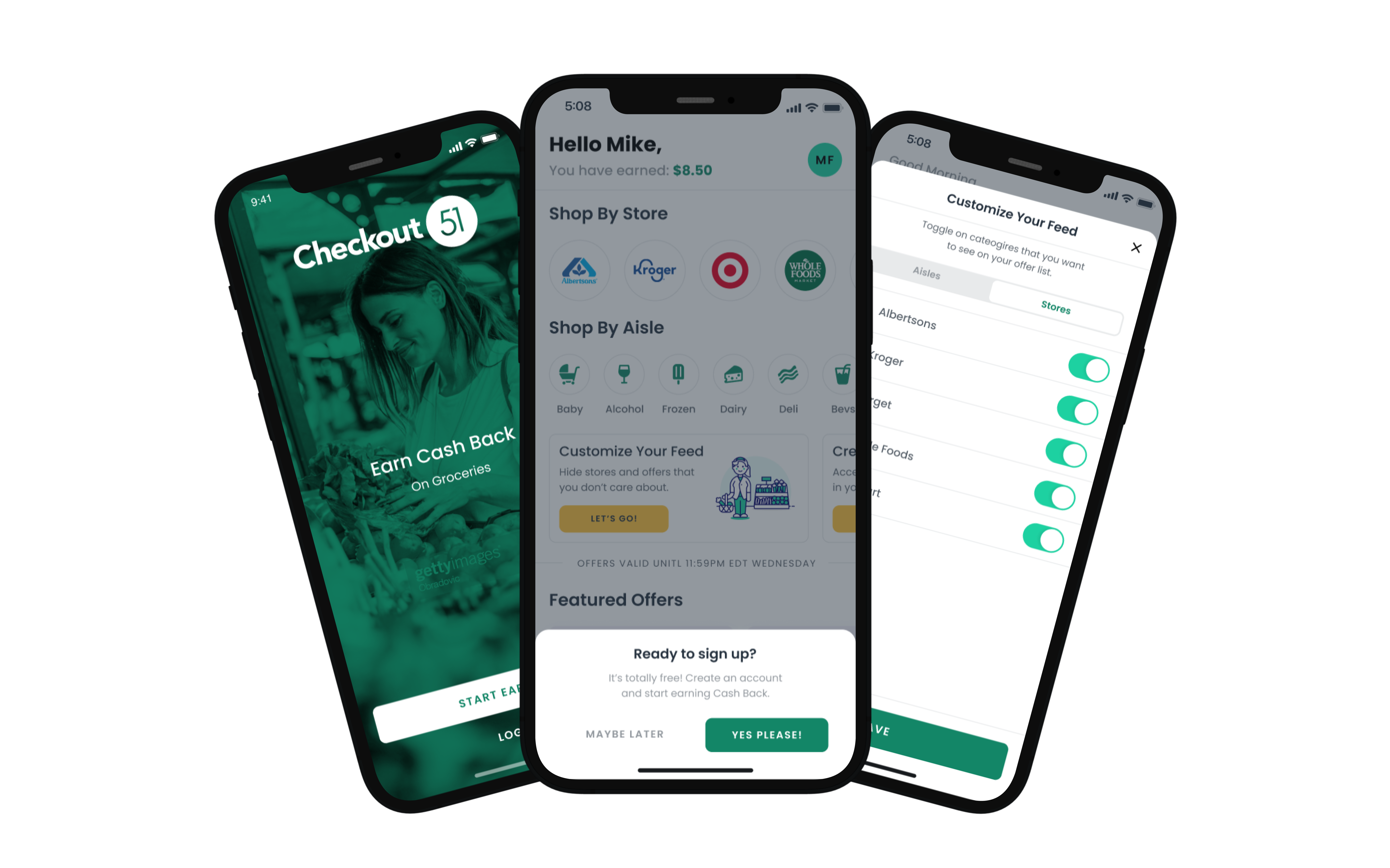
The old onboarding flow asked new users to create an account, grant permissions, and set preferences before they'd seen a single offer. That's backwards. The fastest way to retain a user is to show them value before you ask them for anything.
We rebuilt onboarding around a single rule: let users see offers and feel the product before any friction. Account creation got deferred. Permissions got deferred. The first thing a new user saw was the thing they came for. Retention over 30 days climbed 14%.
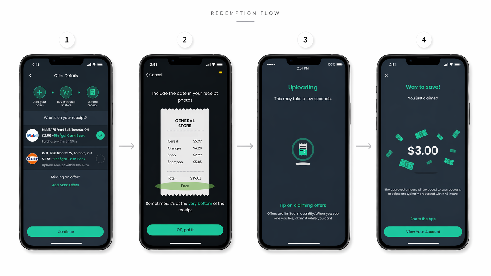
Receipt upload was where conversion died. Users who found an offer, bought the product, and opened the app to claim cashback were dropping off at the receipt step. The old flow made users do the work: frame the receipt, check lighting, retry if it failed, repeat if it still failed.
We redesigned the capture flow around forgiveness rather than precision. The camera guided framing in real time. Edge detection did the work users shouldn't have to. Failed captures got immediate, specific feedback instead of a generic error. The flow shortened. Redemption conversion rose 18%.
You don't move three metrics on a 20M-user app by redesigning individual screens. You do it by changing the system underneath them.
I built Checkout 51's first cross-platform design system, covering iOS, Android, and web. Before this, iOS and Android were essentially two different products with the same name. Components drifted. Patterns didn't match. Engineering time got spent reconciling differences that had no business existing.
The new system unified components across platforms, locked down typography and color, and gave engineering a single source of truth. The immediate payoff was speed: design decisions propagated across platforms instead of being remade for each. The longer payoff was release cadence. Mobile releases accelerated because the system made consistency cheap.
The redesign and the rebrand weren't two projects. They were one project with two surfaces. I partnered with product and marketing executives to align the visual identity across the product and the marketing system, so the app users opened after launch looked like it came from the same company as the ads that brought them there.
New brand colors. New typography. A refreshed logo system. Marketing surfaces that matched the product surfaces for the first time in years. It doesn't sound like much in a bullet list. It's the reason the redesign landed as a relaunch rather than a skin change.

Try the redesigned Offer List prototype →
Consumer mobile at scale is a different sport than enterprise SaaS, and I learned the difference here.
In enterprise, users are paid to use your product. They'll tolerate friction because their job depends on it. In consumer, users have a thirty-second patience window and three competing apps on the same screen. That constraint sharpens the design work. Every extra tap, every extra second, every moment of confusion is a user you're about to lose. You design differently when you know that.
The other lesson was about metrics. I had never had access to the kind of clean, fast feedback loops this project provided. Engagement, retention, and conversion moved visibly after launch. That data did something for me as a designer I didn't expect: it made me more confident about the arguments I make, because I'd seen my design decisions show up in numbers. I've carried that into every role since.
Design leadership, redesign direction, and design system built by me, with two Junior Designers on my team owning flows, wireframes, and supporting work. Executive partnership from product and marketing leadership at Neptune Retail Solutions. Engineering partnership from the iOS, Android, and web teams.
